The photo booth setup wizard provides a fast and simple way of creating the screens and the print layout for common photo booth configurations.
Running the Photo Booth Setup Wizard
If the photo booth shortcut buttons are displayed at the top of the main window simply click on the "Photo Booth Setup Wizard" button (if the shortcuts buttons aren't displayed select View->Photo Booth Shortcuts to display them).
Alternatively click on the File menu and select "Photo Booth Setup Wizard..."
Select the options you wish to use in each of the photo booth wizard screens (described below) and then press the "Finish" button to create the photo booth settings. The settings are saved to a file named settings.xml in the photo booth images folder. These settings can be loaded again by pressing the "Load..." in the photo booth settings dialog.
Step 1: Specify the photo booth images folder
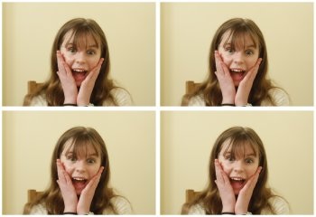
This step allows you to specify the name of the folder where the various screen and layout images should be stored and looks like this:
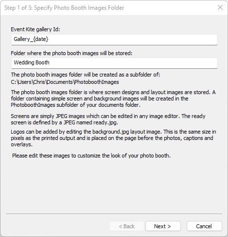
The optional Event Kite gallery id is used to identify the gallery when using Event Kite online galleries and micro-sites. The value can be accessed in print captions, emails and QR codes using the {eventKiteGalleryId} token.
This field can be left empty if you are not using Event Kite and can be edited using the event info dialog (select File->Photobooth event info...).
Enter the name of the photo booth images folder. The screens for the photo booth and the optional layout images will be saved in this folder and can be edited later using an image editor to personalize the look of your booth.
Press the "Next >" button to go to step 2.
Step 2: Specify user interface options
This step allows you to specify the options available to users of your photo booth and looks like this:
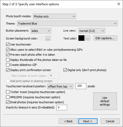
First select the photo booth modes you wish to use:
"Photos only" - creates a photo booth setup which only offers still photos
"Photos or boomerang GIFs" - creates a photo booth which allows the user the choice of still photos or boomerang GIFs
"Photos or video" - creates a photo booth which allows the user the choice of still photos or capturing a short video
"Boomerang GIFs only" - creates a photo booth which only offers boomerang GIFs
"Video only" - creates a photo booth which only offers the option to capture a short video
When "Photos or boomerang GIFs" option is selected the "Single ready screen" option can be used. When this is selected the ready screen will have a start button for photos and a start button for boomerang GIFs (the ready.jpg and video_ready.jpg screens will be the same). If this option is not selected the photo ready screen (ready.jpg) will have a start button and a button to switch to boomerang GIFs. The boomerang GIF ready screen (video_ready.jpg) will have its own start button and a button to switch back to stills photo booth mode.
Next select the theme - the default theme is "Tradewind Blue". Different themes can use different buttons or have different screen backgrounds. Themes can also have different screen captions e.g. to generate screens in a different language.
The following themes come with DSLR Remote Pro:
"Miami" - a simple black or white interface, with options optimised for various screen configurations
"Pop-o-Matic" - a retro themed interface, with options optimised for various screen configurations
"Tradewind Blue" - a clean modern set of buttons with icons on a blue background
"Tradewind Blue - manual layout" - example of how to manually position buttons and touchscreen actions on the ready screen
"Tradewind White" - similar to Tradewind Blue but with a white background
"Simple round buttons" - simple round buttons with text
"German" - the simple round buttons theme with captions in German
"Italian" - the simple round buttons theme with captions in Italian
"Polish" - the simple round buttons theme with captions in Polish
"Romanian" - the simple round buttons theme with captions in Romanian
The "Tradewind Blue" and "Tradewind White" designs were created by The Wilkes Booth Co. Please visit "The Lab" for more exciting interface designs, filters, actions and GIF overlays from the Wilkes Booth Co. .
Please see the section on configuring the setup wizard for information on how to create your own themes.
Select the button placement to specify how the buttons for touchscreen actions are positioned on the screens.
The "sides" option places the buttons down the left and right sides of the screens.
The "bottom" option places the button along the bottom of the screens.
Note: The button images in the theme folder may include manual sizing and placement information in which case the button placement option will not affect the layout
Select the live view style:
"normal (3:2)" - this will display the live view images at the camera's normal aspect ratio so that they occupy about half the screen
"square (1:1)" - this will crop the live view images so that they are square and occupy about half the screen. The print layout will show square photos and the animated GIFs will also be square
"4:3" - this will crop equal amounts from the sides of the live view images so that they have an aspect ratio of 4:3 and occupy about half the screen. The photos in the print layout and animated GIFs will also be cropped to give an aspect ratio of 4:3
"full screen" - this will crop the live view images and resize the it to fill the whole screen. The photos in the print layout and in the animated GIFs will be cropped to match the aspect ratio of the screen. This option will also automatically create ready_overlay.png and video_ready_overlay.png screens to show the start and other buttons.
"disabled" - this option creates a setup with live view disabled e.g. for a magic mirror booth
Notes:
| 1. | The full screen option is only intended to be used with landscape orientation displays. If it is used on a portrait orientation screen it may result in excessive cropping of the live view images. |
| 2. | The square and full screen live view options are not suitable for capturing videos because videos are saved without modification and won't match the live view display if it is cropped. |
Next select the screen background color and the text color to use for screen captions. The default settings are white text on a black background. Please note that if your selected theme provides a background image this will be used instead of the screen background color.
The captions used on each screen can be edited by clicking on the "Edit captions..." button. There is no need to change these settings unless you wish to change the default captions or the language used. Please see the section on configuring the setup wizard for more information about editing the screen captions.
"Use touchscreen" - select this option if your booth has a touchscreen. The setup wizard will automatically add buttons and touchscreen actions to the screens shown to users.
Select the style of buttons to use for the screens. The default setting is for simple round buttons. A selection of different buttons styles come with DSLR Remote Pro and you can add your own styles. Please see the section on configuring the setup wizard for more information.
"Allow users to select B&W or color prints" - If the "Use touchscreen" option is selected this option will add buttons and touchscreen actions to allow users to choose color or B&W prints. If "Use touchscreen" is not selected this option will do nothing but users will be able to select B&W or color using the keyboard shortcuts Ctrl+B and Ctrl+C.
"Preview each photo after it is taken" - when this option is selected a full screen preview will be displayed for 3 secs after each shot is taken.
"Display thumbnails of the photos taken so far" - select this option to display a small thumbnail of each shot taken so far down the right hand of the screen. Each screen will have a series of small gray rectangles added to show where the thumbnails will be placed. Please see the section on the optional thumbnail display for more information.
Select "Create slideshow GIF" to create a animated slideshow GIF or MP4 showing the individual photos captured in photo mode.
Select "Digital only" when one of the photo modes is selected to create and share the print layout without printing it.
"Display print preview and ask for confirmation before printing" - when this option is selected a full screen preview of the print layout will be displayed before printing. If the "Use touchscreen" option is selected buttons and touchscreen actions allowing users to print or reject the photos will be added. If the "Use touchscreen" option is not selected users need to press A to accept the print or X to reject it.
If the "Use touchscreen" option is selected you can also define the maximum number of copies the user can select in the confirm printing screen. The photo booth wizard will create buttons and touchscreen actions for increasing the number of print copies and display these on the right hand side of the screen. Multiple confirm_printing.jpg screen will be created: confirm_printing_1.jpg which is displayed when 1 copy is selected, confirm_printing_2.jpg for 2 copies, confirm_printing_3.jpg for 3 copies etc.
"Add print option in sharing screen" - select this option to allow users to print photos from the sharing screen.
The touchscreen keyboard position setting controls where the touchscreen keyboard is displayed when entering email addresses or mobile phone numbers for texting. It has three options:
| 1. | "top" - displays the keyboard at the top of the screen. |
| 2. | "offset from the top" - specifies how from the top of the screen the keyboard should be displayed in pixels. |
| 3. | "bottom" - displays the keyboard at the bottom of the screen. This is the default settings. |
"Twitter tweet" - select this option to allow users to post photos their personal Twitter feed direct from the photo booth (requires an internet connection). Please see the section on uploading photos to social networks for more information on posting photos to Twitter.
"MMS/SMS" - select this option to allow users to text photos to their cellphone via MMS or SMS (requires an internet connection and an account with Twilio.com). Please see the section on uploading photos to social networks for more information texting photos.
"Email photos" - select this option to allow users to email photos direct from the photo booth (requires an internet connection). Please see the section on uploading photos to social networks for more information on emailing photos.
"Enable video booth mode (10 sec video capture)" - select this option if you are using a camera which supports video (e.g. a Rebel T3i/EOS 600D) and wish to offer users the option to record a 10 second video (the settings can be adjusted later using the "Video Booth Settings" dialog).
Select the "Capture 'boomerang' animated GIFs to capture boomerang style animated GIFs instead of normal videos. This will set everything up to create a an animated GIF that is approximately 3 secs long and plays forwards then backwards at approximately double speed.
The inactivity timeout can be set to switch the booth to standby mode and display the welcome.jpg screen after a preset number of seconds if there is no user input. Set this to 0 to disable the inactivity timeout. The inactivity timeout is useful if the photo booth is not in continuous use because it disables the live view display and puts the booth into standby mode. Disabling live view will allow the camera's sensor to cool down to avoid possible overheating problems. The booth can be switched back to the ready screen by pressing F6 or touching the screen (if available).
Click on the "Use default settings" button to load the default settings for the photo booth setup wizard. This will select photos only using the Tradewind Blue theme with black text on a light gray background.
If photo mode is selected press the "Next >" button to go to step 3 to setup the printer and select the print layout. If photo mode is not selected press the finish button to create the photo booth settings and screens.
Step 3: Printer Settings and Print Layout
This step displays the current printer settings and asks you to select a print layout. The settings for a Mitsubishi CP70D printer loaded with 6x4 paper are shown below:
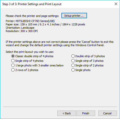
First check the printer settings and click on the "Setup printer..." button if they need changing.
Please note: if you printing a double strip of 3 or double strip of 4 photos and are using a dyesub printer which can cut a 4"x6" sheet into two 2"x6" strips you need to select this option in the printer driver by clicking on the "Setup printer..." button.
Next select one of the seven print layout options:
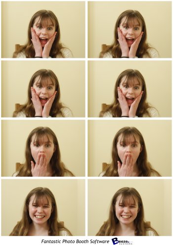
"Classic double strip of 4 photos" - This prints two columns of four images side by side as shown below:
|
"Single strip of 4 photos" - This prints a single column of four images as shown below. This option is useful for printers like the Sony UP-DR200 which can cut 6x2 strips from 6x4 paper and treat these as 6x2 pages.
|
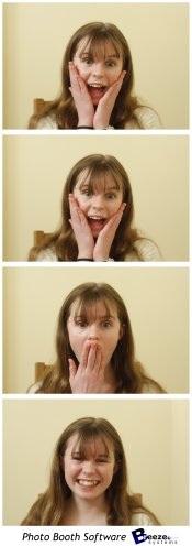
"Double strip of 3 photos" - Similar to the "Classic double strip of 4 photos" but with only three photos and more space for logos etc.
|
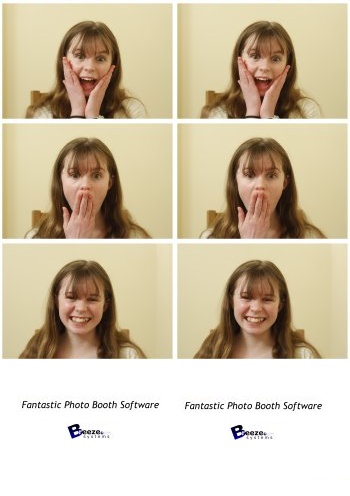
"Single strip of 3 photos" - Similar to the "Single strip of 4 photos" but with only three photos and more space for logos etc.
|
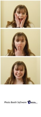
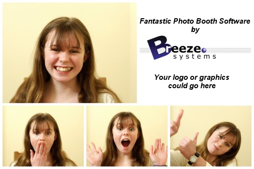
"1 large photo with 3 smaller ones below" - This layout gives plenty of space for logos and captions as shown below:
|
"2 rows of 2 photos" - This option fills the page with four equally sized photos arranged in a 2 x 2 grid:
|
"Single photo" - This option fills the page with a single photo:
When you have selected your preferred layout press the "Finish" button to create the photo booth settings and screens
What happens next?
Please try running the booth and taking a set of photos to check the print layout. If the photos aren't correctly centered on the page or the gaps between the photos is too large you can adjust the settings by clicking on the "Print Layout" shortcut button (or by selecting File->Photo Booth settings... and clicking on the "Settings..." button to the right of the "Custom layout" checkbox. Please see the section on the print layout editor for more details.
Logos and other graphics can be added to the prints by creating a background.jpg image and editing this in an image editor. The background.jpg image needs to be the same size in pixels as the print output. The easiest way to create a background.jpg image is to set the output to JPEG only and take a set of test photos. Then edit the JPEG copy of the print layout in an image editor to add logos etc. and save this in your photo booth images folder as background.jpg.
The various screens presented to the user are defined using JPEG images saved in the photo booth images folder. The look of your booth can be customized simply by editing the screen JPEGs using an image editor such as Photoshop Elements. The screen that is shown when the booth is ready to take the next set of photos is called ready.jpg. Please see the section on images displayed to the user for more details.
There are many other settings that can be adjusted. Please see the section on advanced photo booth settings for more information. There is a series of articles on our website which includes lots of useful information about photo booth shooting and a section giving answers to frequently asked questions.
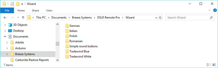
Themes
Themes provide a way of customizing the appearance of the screens created by the photo booth setup wizard. A theme can have its own touchscreen button designs, modify the screen background and change the text used for the captions in the screen images. Themes are defined by creating subfolders in the "wizard" folder in the DSLR Remote Pro installation folder. The name of the subfolder defines the theme's name and this is what appears in the theme dropdown list in step 3 of the setup wizard.
For example, the default theme is "Simple round buttons" and is defined by the contents of the folder:
C:\Program Files (x86)\BreezeSys\DSLR Remote Pro\Wizard\Simple round buttons
Please note: You need administrator privileges to modify files in the "Program Files (x86)" folder. This is because Windows protects the programs folder to prevent the files from being damaged.
The photo booth setup wizard looks for the Wizard folder in your documents first and then looks in the "Program Files (x86)" folder. Copy the Wizard folder to your documents folder to make it easier to modify its contents e.g.
Button Style
The buttons used for the touchscreen actions in the screens created by setup wizard are defined using PNG images. The setup wizard looks in the subfolder for the selected theme for PNG files representing the buttons e.g. Start.PNG for the start button. If the theme's subfolder does not define the button the setup wizard will use the default button design in the buttons subfolder.
e.g. If the selected theme is "Simple round buttons" the wizard will look in the folder "C:\Program Files (x86)\BreezeSys\DSLR Remote Pro\Wizard\Simple round buttons" for a PNG image named Start.PNG to define the start button. If the folder does not contain a Start.PNG image the setup wizard will use the default button, "C:\Program Files (x86)\BreezeSys\DSLR Remote Pro\buttons\Start.PNG" instead.
The following PNG button images are used by the setup wizard:
photo_start.png - start button in photo mode (defaults to start.png if there is no photo_start.png image)
boomerang_start.png - start button for boomerang GIFs (defaults to start.png if there is no boomerang_start.png image)
video_start.png - start button in video booth mode (defaults to start.png if there is no video_start.png image)
bw.png - select B&W in photo and animated GIF ready screens
color.png - select color in photo and animated GIF ready screens
gif.png - select boomerang GIFs
photo.png - select normal photo booth mode
video.png - select video booth mode
print_confirm.png - accept prints in confirm printing screen (defaults to accept.png if print_confirm.png not found)
print_cancel.png - reject prints in confirm printing screen (defaults to reject.png if print_cancel.png not found)
minus.png - reduce the number of copies to print in print confirmation screen
plus.png - increase the number of copies to print in print confirmation screen
email.png - email button in the sharing screen
mms.png - texting button in the sharing screen
print.png - print button in the sharing screen
twitter.png - Twitter button in the sharing screen
cancel.png - button to exit the sharing screen
replay.png - replay video in video playback screen
accept.png - accept animated GIF or video
reject.png - reject animated GIF or video
green_screen_settings.png - display green screen settings dialog (requires <options> for sizing and placement)
creative_filter_settings.png - display creative filter settings dialog (requires <options> for sizing and placement)
photo_preview_accept.png - accept the photo that has just been taken (requires <options> for sizing and placement)
photo_preview_retake.png - retake the photo that has just been taken (requires <options> for sizing and placement)
photo_preview_abort.png - reject the photo that has just been taken and return to the ready screen (requires <options> for sizing and placement)
welcome.png - optional button to switch to the ready screen from the standby (welcome.jpg) screen (requires <options> for sizing and placement)
exit.png - optional button to exit photo booth mode (make this fully transparent to create a hidden button and use <options> for sizing and placement)
By default the PNG button image will be placed on the screen using the current layout option e.g. arranged down the sides of the screen or along the bottom. The size and placement of each button can be specified manually by appending the following modifiers enclosed in curly brackets to the end of the filename:
T - place the center of the button at the top of the screen
B - place the center of the button at the bottom of the screen
L - place the center of the button at the left of the screen
R - place the center of the button at the right of the screen
W - width of the button
H - height of the button
Each modifier can be followed by a number (to specify the offset in pixels) or a number followed by % (to specify the percentage offset wrt the screen size). The number can be an integer (e.g. 10, 20, 30) or have a decimal point for greater precision (e.g. 10.5%).
Note: the aspect ratio of the button is preserved when resizing. If both the height and width modifiers are used only the last one to be defined will be used to resize the button.
Examples:
start.png - place the start button in the screen using the selected layout option
start_{T}.png - place the start button at the top of the screen, centered horizontally
start_{T50}.png - place the center of the start button 50 pixels down from the top of the screen, centered horizontally
start_{T10%}.png - place the center of the start button 10% of the screen height from the top of the screen, centered horizontally
start_{T10%L}.png - place the center of the start button on the left of the screen and 10% of the screen height from the top of the screen (the left half of the button will be off the screen)
start_{B100R50}.png - place the center of the start button 50 pixels from the right side of the screen and 100 pixels from the bottom of the screen
start_{T10%W10%}.png - place the center of the start button 10% of the screen height from the top of the screen, centered horizontally and resize to 10% of the screen width
It is strongly recommended that either all buttons have size and placement modifiers to override the automatic placement when creating a theme. If some buttons have size and placement modifiers and some don't it is likely that buttons will overlap.
The "Tradewind Blue - manual layout" theme gives an example of how buttons can be manually positioned on the ready screen.
Each screen can be animated using an optional animated GIF by placing a GIF with the screen's name in the subfolder for the selected theme e.g. ready.gif for the ready.jpg screen.
If the GIF should play in a continuous loop the suffix _loop should be added to the filename e.g. ready_loop.gif.
By default the animated GIF will be centered on the screen. The position can be specified by appending the following modifiers enclosed in curly brackets to the end of the filename:
T - place the center of the animated GIF at the top of the screen
B - place the center of the animated GIF at the bottom of the screen
L - place the center of the animated GIF at the left of the screen
R - place the center of the animated GIF at the right of the screen
W - width of the animated GIF
H - height of the animated GIF
Each modifier can be followed by a number (to specify the offset in pixels) or a number followed by % (to specify the percentage offset wrt the screen size).
Examples:
ready.gif - place a GIF that plays once in the ready screen and place it in the center of the screen
ready_loop.gif - place a GIF that plays in a continuous loop in the ready screen and place it in the center of the screen
ready_loop_{T}.gif - place a GIF that plays in a continuous loop in the ready screen and place its center at the top of the screen (the top half will be off the screen), centered horizontally
ready_loop_{T50}.gif - place a GIF that plays in a continuous loop in the ready screen and place its center 50 pixels down from the top of the screen, centered horizontally
ready_loop_{T10%}.gif - place a GIF that plays in a continuous loop in the ready screen and place its center 10% of the screen height from the top of the screen, centered horizontally
ready_loop_{T10%L}.gif - place a GIF that plays in a continuous loop in the ready screen and place its center on the left of the screen and 10% of the screen height from the top of the screen
ready_loop_{B100R50}.gif - place a GIF that plays in a continuous loop in the ready screen and place its center 50 pixels from the right side of the screen, 100 pixels from the bottom of the screen
ready_loop_{T10%W10%}.gif - place a GIF that plays in a continuous loop in the ready screen and place its center 10% of the screen height from the top of the screen, centered horizontally and resize to 10% of the screen width
Animated GIFs can also be used for the photo, boomerang GIF or video start buttons by naming them:
start_photo.gif - animated GIF for starting the countdown when in photo mode
start_boomerang.gif - animated GIF for starting the countdown when in video booth mode when the boomerang GIF option is selected in the setup wizard
start_single_ready.gif - special animated GIF for starting the countdowns when "Photos and boomerang GIFs" and the "Single ready screen" option are selected (see the "Single Ready Screen" notes section for more information)
start_video.gif - animated GIF for starting the countdown when in video mode when the video option is selected in the setup wizard
The "start" animated GIFs can use the same modifiers as other GIFs (_loop and T, B, L, R, W, H in curly brackets). The setup wizard will create the appropriate touchscreen action "start" action over the animated GIF.
Please note: If a "start" animated GIF is used the setup wizard will not add the equivalent "start" PNG button to the screen.
Also, if a start_photo.gif animated GIF is used the ready_loop.gif will be ignored. Similarly if a start_boomerang.gif or start_video.gif is used the video_ready.gif will be ignored. This is because each screen can only display one animated GIF.
"Single Ready Screen" Notes
When photo booth mode is set to "Photos and boomerang GIFs" and the "Single ready screen" option is selected the button PNG images and GIFs for animated GIFs are handled differently.
If the theme folder contains a start_single_ready.gif animated GIF this will be used for both the photo start and boomerang GIF start touchscreen actions and will be saved as ready.gif and video_ready.gif in the photo booth images folder.
If the GIF is landscape (wider than it is tall) the left half will be used to start taking photos (using the touchscreen action "Select photobooth+start") and the right half will be used to start capturing a boomerang GIF (using the touchscreen action "Select video booth+start").
If the GIF is portrait (taller than it is wide) the top half will be used to start taking photos (using the touchscreen action "Select photobooth+start") and the bottom half will be used to start capturing a boomerang GIF (using the touchscreen action "Select video booth+start").
If the theme folder does not contain a start_single_ready.gif animated GIF the PNG button for starting taking photos will be selected as follows:
start_photo_single_ready_{<options>}.png - used if a matching file is found in the theme folder
start_{<options>}.png - used if a matching file is found in the theme folder (and start_photo_single_ready_{<options>}.png is not found)
photo.png - used if found in the theme folder otherwise the default photo.png image in the buttons folder is used
If the theme folder does not contain a start_single_ready.gif animated GIF the PNG button for capturing boomerang GIFs will be selected as follows:
start_boomerang_single_ready_{<options>}.png - used if a matching file is found in the theme folder
boomerang_start_{<options>}.png - used if a matching file is found in the theme folder (and start_boomerang_single_ready_{<options>}.png is not found)
gif.png - used if found in the theme folder otherwise the default gif.png image in the buttons folder is used
Separate button PNG images are also available for color and B&W in the single ready screen:
color_single_ready_{<options>}.png - if this button image is not found in the theme folder the color.png image is used
bw_single_ready_{<options>}.png - if this button image is not found in the theme folder the bw.png image is used
Screen Backgrounds
By default screens are created with a solid background color using the color specified in step three of the setup wizard. An image can be used for the background by placing a JPEG image in the subfolder for the selected theme. The JPEG image should be named background_tiled.jpg, background_stretched.jpg or background_cropped.jpg. The filename tells the setup wizard what to do if the background image is not the same size as the computer's screen:
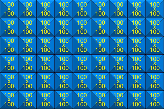
background_tiled.jpg
The screen background is formed by tiling it with the background image starting from the top left hand corner. e.g. if the screen is 900x600 pixels and background_tiled.jpg is 100x100 pixels the screen backgrounds will be formed by tiling 6 rows of 9 copies of the background image:
background_stretched.jpg
The screen background is formed by stretching the background image so that it fills the screen e.g. if the screen is 900x600 pixels and background_stretched.jpg is 100x100 pixels the screen backgrounds will be formed by stretching the background image until it is 900 pixels wide and 600 pixels high. If the background_stretched.jpg image's aspect ratio is not the same as the screen's aspect ratio it will be distorted to fit:
background_cropped.jpg
This is similar to the background_stretched.jpg except that the aspect ratio of the background image is preserved. The background_cropped.jpg image is resized so that it covers the whole screen and any overlap is cropped off the right hand or bottom edges e.g. if the screen is 900x600 pixels and background_stretched.jpg is 100x100 pixels the screen backgrounds will be formed by resizing the background image until it is 900 pixels wide and 900 pixels high and then the bottom 300 pixels are cropped off the bottom:
Caption text
The text for the captions added to the screens created by the setup wizard defaults to simple captions in English. These can be edited to create screens in a different language or if you you prefer different messages.
To edit the caption text click on the "Edit captions..." button in the "Step 3: Specify user interface options" screen when running the wizard. This will display the dialog shown below:
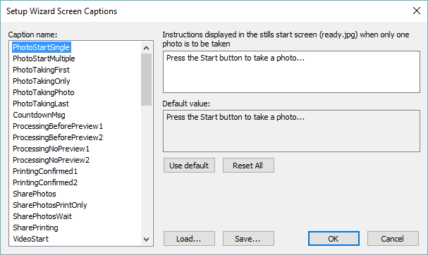
The name of the caption to edited is displayed in the list on the left and a description is displayed on the right. The current text is displayed in the edit box below the description and can be edited as required. The default text is displayed below the edit box. Press the "Use default" button to copy the default text into the edit box.
The settings can be saved to file for future reference by clicking on the "Save..." button. Previously saved settings can be loaded by clicking on the "Load..." button.
The following tokens can be used in the caption text:
{photoboothSubDir} - This is the same as name of the photo booth images folder specified in step 2 of the setup wizard
{photoboothNumImages} - The number of photos to be taken in stills photo booth mode
{themeName} - The name of the theme selected in step 3 of the setup wizard
{eventName} - Please see this section for more information on the event name and strings.
{eventString1}
{eventString2}
{eventString3}
{eventString4}
{eventString5}
When the setup wizard is run it will look in the selected theme's subfolder for a file named captions.xml defining the text to be used for the captions in each screen. The captions.xml file doesn't need to contain all of the text strings used by the wizard. It can be used to modify a few strings e.g. the captions.xml file below will remove the "Press the Start button to take a photo..." text displayed in the ready.jpg screens:
<?xml version="1.0" encoding="UTF-8"?>
<dslr_remote_pro version="3.7.3">
<photobooth_wizard_captions>
<PhotoStartSingle></PhotoStartSingle>
<PhotoStartMultiple></PhotoStartMultiple>
</photobooth_wizard_captions>
</dslr_remote_pro>
Filters
Filter files and buttons can be added to the setup wizard by placing the filter JPEG file and associated PNG button image in the wizard theme folder. This option is only available when manual button sizing and placement is used for the color and B&W buttons (if color and B&W is selected in the wizard) and the filter buttons. An optional button image can be defined to indicate that the color, B&W or filter is not currently selected by appending _unselected to the filename. The setup wizard will create copies of the ready screens with suitable suffixes so that they are displayed when color, B&W or one of the filter options is selected.
Example: to create color, B&W and filter1.jpg options with buttons 100 pixels high placed on the top left of the screen the following files are required:
color_{T50L50H100}.png |
make color button 100 high wide and place in the top left corner of the screen |
color_unselected_{T50L50H100}.png |
optional button image displayed when color mode is not selected |
bw_{T150L50H100}.png |
make B&W button 100 pixels high and place under the color button |
bw_unselected_{T50L50H100}.png |
optional button image displayed when B&W mode is not selected |
filter1_{T250L50H100}.png |
make filter 1 button 100 pixels high and place under the B&W button |
filter1_unselected_{T150L50H100}.png |
optional button image displayed when filter 1 is not selected |
filter1.jpg |
the JPEG lookup table file defining filter 1 |
Additional Files (keyboard, droplets etc.)
By default the wizard will create keyboard.xml files using the screen background color and text color defined in the user interface options screen. Place a keyboard.xml file in the theme folder to override these settings. If the wizard finds a keyboard.xml file (e.g. email_keyboard.xml) it will be copied to the photo booth images folder without modification.
Note: Please don't use the keyboard.xml file in the theme folder to define the actual keys because their positions will not work with different screen resolutions.
Any files in the wizard theme folder with a .exe file extension (e.g. Photoshop droplets) or a .dll file extension (e.g. PhotoboothCreativeFilter.dll) are also copied to the photo booth images folder.