An optional touchscreen keyboard can be displayed at the start or end of the photo booth shooting sequence to allow users to enter information such as their email address. To enable the keyboard set the photo booth start options in the photo booth settings dialog to "Touchscreen" and click on the "Settings..." button. The touchscreen settings dialog will be displayed:
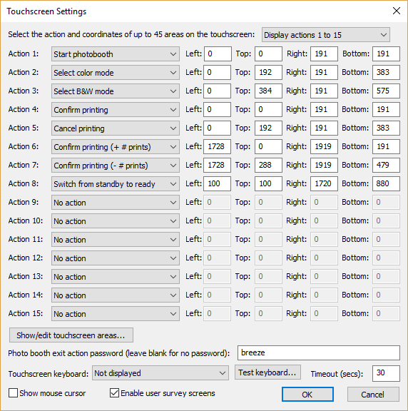
Then select the required touchscreen keyboard option from the dropdown list:
"Not displayed" - the touchscreen keyboard is not displayed
"Email input at start of sequence" - the email input touchscreen keyboard is displayed when the user presses the start button before any of the photos are taken
"Email input at end of sequence" - the email input touchscreen keyboard is displayed after the photos have been taken and the optional print confirmation screen has been displayed (it isn't displayed if the user chooses not to print the photos)
"Email input after taking photos".- the email input touchscreen keyboard is displayed immediately after taking the photos before the optional print confirmation screen
"Message input at end of sequence" - the message input touchscreen keyboard is displayed after the photos have been taken and the optional print confirmation screen has been displayed (it isn't displayed if the user chooses not to print the photos)
The "Timeout (secs):" setting allows an inactivity timeout to be specified. If the user does not tap the touchscreen for a while the timeout will automatically close the touchscreen keyboard. This is useful if the user leaves the photo booth without using the touchscreen keyboard as it allows the booth to automatically close the touchscreen keyboard and display the ready screen ready for the next user.
Select the "Show mouse cursor" option to display a mouse cursor in the ready screen and other screens requiring user input. This setting allows a photo booth to operating using a mouse if a touchscreen display is not available.
Select "Enable user survey screens" to enable the display of user survey screens (see the User Survey section for more information).
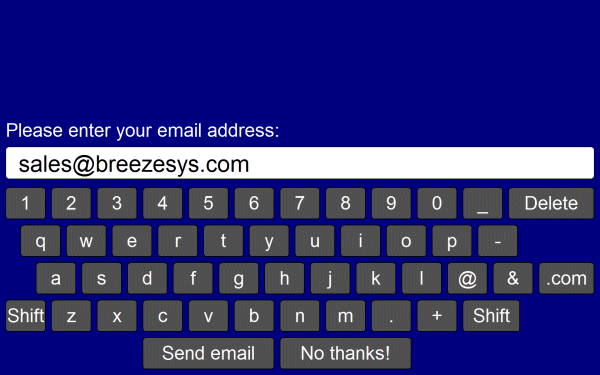
The touchscreen keyboard can be tested by pressing the "Test keyboard..." button and selecting the keyboard type to test from the menu. The default keyboard layout will fill the screen and look similar to the screenshot below:
The text entered by the user is saved in the <user_data> tag (and the <user2_data> tag if two text fields are defined) in the XML file written at the end of the photo booth shooting sequence. If any checkboxes are defined (see below) their status will be saved in <chkbox1>, <chkbox2> etc. tags e.g. if the user selects the first checkbox the XML will contain <chkbox1>1</chkbox1>. The XML file is saved in the same folder as the photos downloaded from the camera (see preferences) e.g.
<?xml version="1.0" ?>
<breeze_systems_photobooth version="1.0">
<photo_information>
<date>2011/01/26</date>
<time>16:37:19</time>
<user_data>sales@breezesys.com</user_data>
<photobooth_images_folder>C:\Photobooth\PhotoboothImages</photobooth_images_folder>
<photos>
<photo image="1">20110126_163719_1.JPG</photo>
<photo image="2">20110126_163719_2.JPG</photo>
<photo image="3">20110126_163719_3.JPG</photo>
<photo image="4">20110126_163719_4.JPG</photo>
<output>prints\20110126_163719.jpg</output>
</photos>
</photo_information>
</breeze_systems_photobooth>
There is a default timeout of 300 secs after which time the touchscreen keyboard will be automatically canceled. This timeout is stored in the Windows registry key:
HKEY_CURRENT_USER\Software\BreezeSystems\DSLRRemotePro\100\PhotoboothKeyboardTimeout
When the "Message input at end of sequence" touchscreen option is used the data entered by the user is also stored in the {message} token which can be used in the captions in the print layout or in email messages when using the sharing options.
Customizing the keyboard
The layout of the keyboard can be customized by creating an XML settings file called keyboard.xml and putting this in the photo booth images folder. This gives control over the size and position of the keys, the background color etc. A series of keyboard images can also be used if you need more control of the appearance of the keyboard.
The easiest way to customize the keyboard is to save a copy of the XML file and TIFF screen images used to define the default keyboard layout and then edit them as required. The files can be saved by first displaying the keyboard by pressing the "Test keyboard..." button and then holding down both the Shift and Ctrl keys and pressing the left mouse button. The keyboard.xml file will look something like:
<?xml version="1.0" ?>
<breeze_systems_photobooth version="2.2">
<photobooth_settings>
<keyboard>
<text_point_size>480</text_point_size>
<prompt1 rows="1">Please enter your email address:</prompt1>
<text1_y>411</text1_y>
<text1_x>50</text1_x>
<text1_r>300</text1_r>
<background_color>0x000080</background_color>
<transparent_color>0x000080</transparent_color>
<text_color>0xFFFFFF</text_color>
<show_cursor>0</show_cursor>
<show_mouse_cursor>0</show_mouse_cursor>
<key>
<left>58</left>
<top>630</top>
<width>112</width>
<height>89</height>
<legend>q</legend>
<shifted_legend>Q</shifted_legend>
<code>q</code>
<shifted_code>Q</shifted_code>
</key>
<key>
<left>186</left>
<top>630</top>
<width>112</width>
<height>89</height>
<legend>w</legend>
<shifted_legend>W</shifted_legend>
<code>w</code>
</key>
...
<key>
<left>1296</left>
<top>840</top>
<width>160</width>
<height>89</height>
<legend>Shift</legend>
<shifted_legend>Shift</shifted_legend>
<code>Shift</code>
<shifted_code>Shift</shifted_code>
</key>
<key>
<left>400</left>
<top>945</top>
<width>368</width>
<height>89</height>
<legend>Send email</legend>
<shifted_legend>Send email</shifted_legend>
<code>OK</code>
<shifted_code>OK</shifted_code>
</key>
<key>
<left>784</left>
<top>945</top>
<width>368</width>
<height>89</height>
<legend>No thanks!</legend>
<shifted_legend>No thanks!</shifted_legend>
<code>Cancel</code>
<shifted_code>Cancel</shifted_code>
</key>
</keyboard>
</photobooth_settings>
</breeze_systems_photobooth>
The <prompt1> tag defines the text that is displayed above the user input area and defaults to "Please enter your email address:". The <text1_x> and <text1_y> tags specify the position of the user input area. This is specified as the number of pixels down from the top, left corner of the screen. The right hand side of the user input area can be specified using the <text1_r> tag or you can specify the width using the <text1_w> tag.
Additional prompts can be added by including <prompt2>, <text2_x>, <text2_y>, <text2_r> etc. tags up to a maximum of 10 user input areas.
The prompt tags can have an optional password attribute which if set to "1" will display the text in the user input area as * characters e.g. <prompt1 password="1">Please enter your password:</prompt1>.
The prompt tags can have an optional mandatory attribute which if set to "1" means that the prompt must contain text e.g. <prompt1 mandatory="1">Please enter your name:</prompt1>.
The prompt tags can have an optional email_address attribute which if set to "1" will check that the text looks like an email address in the form name@domain.com e.g. <prompt1 email_address="1">Please enter your email address:</prompt1>. If the text does not appear to be an email address an error message saying "Please enter a valid email address in the form name@domain.com" will be displayed. The text of this error message can be changed in the email settings dialog.
The prompt tags can have an optional value attribute to define an initial value. This value can include tokens which are evaluated when the keyboard is displayed e.g. <prompt1 value="{eventString1}">Email address:</prompt1>
The prompt tags can include an optional id attribute which can be used to help identify input fields for user survey data e.g. <prompt1 id="name">Please enter your name:</prompt1>
Prompt tags in survey data can also be used to collect an email address and automatically send the email when the sharing screen is displayed by setting the id to "autoEmail" e.g. <prompt1 id="autoEmail" email_address="1">Please enter your email address:</prompt1>.
The input text area is normally on a single line. Multiple lines can be used by setting the prompt tag's rows attribute to 2 or more e.g. <prompt1 rows="3">Please enter a message:</prompt1>.
When more than one user input area is defined users can switch between the input areas by touching them. The currently selected input area is highlighted in red.
The optional <text_point_size> tag defines the size of the text font used in the user input area. This is specified in tenths of a point and defaults to 480 (a point size of 48).
The text entered by the user is stored in the <user_data>, <user2_data> etc. fields in the XML file saved with the photos.
You can use attributes instead of tags to define a text input area more concisely e.g.
<prompt1 id="email" email_address="1" mandatory="1" x="20" y="172" w="1496">Please enter your name</prompt1>
is the same as
<prompt1 id="email" email_address="1" mandatory="1>Please enter your name</prompt1>
<text1_x>20</text1_x>
<text1_y>172</text1_y>
<text1_w>1496</text1_w>
Checkboxes
Up to 10 checkboxes can be added using the <chkbox1_prompt>, <chkbox1_x>, <chkbox1_y>, <chkbox2_prompt>, <chkbox2_x>, <chkbox2_y> etc. tags. The <chkbox1_prompt> tag specifies the text displayed to the right of the text box and can include a value attribute to specify whether the checkbox is initially checked or not e.g. <chkbox1_prompt value="0">Checkbox prompt (default off)</chkbox1_prompt> or <chkbox1_prompt value="1">Checkbox prompt (default on)</chkbox1_prompt>. A checkbox can also be made mandatory (i.e. the user has to check the checkbox before pressing the "OK" button) by adding the mandatory attribute to the <chkbox1_prompt> tag e.g. <chkbox1_prompt mandatory="1">I agree to the terms and conditions</chkbox1_prompt>. The optional point_size attribute can be used to specify the point size of the legend and also the size of the checkbox box e.g. <chkbox1_prompt point-size="240">Checkbox</chkbox1_prompt> adds a checkbox with the legend displayed using 24 point text.
The chkbox_prompt tags can include an optional id attribute which can be used to help identify input fields for user survey data e.g. <chkbox1_prompt id="over18"> I am over 18 years of age</chkbox1_prompt>
The <chkbox1_x> and <chkbox1_y> tags specify the position of the checkbox. These can be specified as separate tags or as attributes of the chkbox tag.
Example: this creates a checkbox which is initially set, has the caption "Checkbox prompt" with a point size of 24 and is placed 100 pixels from the left of the screen and 200 pixels from the top of the screen:
<chkbox1_prompt point_size="240" value="1" x="100" y="200">Checkbox prompt</chkbox1_prompt>
and is equivalent to this:
<chkbox1_prompt point_size="240">Checkbox</chkbox1_prompt>
<chkbox1_x>100</chkbox1_x>
<chkbox1_y>200</chkbox1_y>
The checkbox status is stored in the <chkbox1>, <chkbox2> etc. fields in the XML summary file saved with the photos.
Adding an Information Page
An optional information page can be displayed to provide more information to the user e.g. a privacy policy or help information.
To add an information page create a JPEG or TIFF screen image with the same name as the keyboard.xml file e.g. email_keyboard_info.jpg. This can be displayed by defining a key with the code "info". The info screen will close automatically after a timeout of 30 secs. It can be closed manually by defining a key with the code "info close" and tapping on it. Please see the "User Survey" section for an example.
Color and Other Settings
The <background_color> tag specifies the background color of the window and the <key_text_color> specifies the color for the prompt text and key legends.
The optional <text_foreground_color> tag specifies the foreground color for text displayed in the user input areas. The default value if this tag is omitted is black (0x000000).
The optional <text_background_color> tag specifies the background color for the user input areas. The default value if this tag is omitted is white (0xFFFFFF).
The optional <text_box_outline_color> tag specifies the color for outline of text input areas. The default value if this tag is omitted is black (0x000000).
The optional <text_box_outline_highlight_color> tag specifies the color for outline of the active text input area when more than one text input is defined. The default value if this tag is omitted is red (0xFF0000).
The optional <transparent_color> tag specifies a color which will be made transparent when the keyboard is displayed.
All colors should be hexadecimal RGB values e.g. 0x000000 for black, 0xFF0000 for red, 0x00FF00 for green, 0x0000FF for blue, 0xFFFFFF for white.
The <show_cursor> tag specifies whether a gray cursor is shown in the user input area. Set this to 1 to display the cursor or 0 to hide it. The cursor display is useful if the keyboard allows the entry of spaces.
The <show_mouse_cursor> tag specifies whether a the mouse cursor is displayed, The default setting is for the mouse cursor not to be displayed.
The <vertical_position> tag specifies the default position of the keyboard if no keys are defined in the XML file. Set this to "top" to place the keyboard at the top of the screen, "bottom" to place it at the bottom of the screen or set it to the number of pixels measured from the top of the screen.
The <key> tag specifies the size and position of each key, its legends and what should be typed when it is pressed. The top left corner of the key is defined using the <left> and <top> tags and the width and height are specified using the <width> and <height> tags (all values are in pixels). The <shifted_legend> tag specifies what is displayed on the key when the shift key is pressed and the <legend> specifies the key legend when shift is not pressed.
The <shifted_code> tag specifies what is typed when the key is pressed when shift is pressed and the <code> tag specifies what is typed when the shift key is not pressed. The following codes have special values:
"Shift" - puts the keyboard into shifted mode (i.e. upper case) when pressed
"Delete" - delete a character from the text input field
"Clear" - clear all text input fields
"Newline" - start a new line in a multi-line text input field
"Left" - move the cursor left in a text input field
"Right" - move the cursor right in a text input field
"info" - display the optional info screen if defined
"info close" - close the optional info screen and return to the touchscreen keyboard
"OK" - closes the keyboard window and returns the user input if at least one text input field contains text and all inputs marked as mandatory have been entered
"OK all" - closes the keyboard window and returns the user input if all the input fields contain some text
"OK none" - closes the keyboard window and returns the user input even if none of the input fields contain text provided all inputs marked as mandatory have been entered
"Cancel" - closes the keyboard window and cancels the user input
"Close" - closes the keyboard and returns to the ready screen when the "Email input at start of sequence" touchscreen keyboard option is used
International and special characters need to be added in UTF-8 unicode format e.g. the Euro symbol, , is defined in UTF-8 as 0x20AC. This needs to added to the XML file as € e.g.
<key>
<left>58</left>
<top>630</top>
<width>112</width>
<height>89</height>
<legend>&#&x20ac;</legend>
<shifted_legend>&#&x20ac;</shifted_legend>
<code>&#&x20ac;</code>
<shifted_code>&#&x20ac;</shifted_code>
</key>
The keyboard.xml can just include additional settings and the touchscreen keyboard will use the default layout (shown above) if it doesn't contain any <key> tags. For example you could use the default keyboard layout and add a checkbox to ask users whether they consent to their photos being uploaded to a website using the keyboard.xml file below:
<?xml version="1.0" ?>
<breeze_systems_photobooth version="2.3">
<photobooth_settings>
<keyboard>
<chkbox1_prompt value="0">I agree to my photos being posted on a web site</chkbox1_prompt>
<chkbox1_x>38</chkbox1_x>
<chkbox1_y>70</chkbox1_y>
</keyboard>
</photobooth_settings>
</breeze_systems_photobooth>
Or you could use it to place the keyboard at the top of the screen e.g. for a mirror booth:
<?xml version="1.0" ?>
<breeze_systems_photobooth version="2.3">
<photobooth_settings>
<keyboard>
<vertical_position>top</vertical_position>
</keyboard>
</photobooth_settings>
</breeze_systems_photobooth>
Example 1: Adding a CC line to the email keyboard
To do this we need to add a second prompt of type email_address to the email keyboard. Start with the default email_keyboard.xml file by opening the touchscreen editor, clicking on "Test keyboard..." and selecting "Email keyboard". Then hold down the Shift and Ctrl keys and left click the mouse to save the XML file and the keyboard images. Next delete the four keyboard image files (otherwise we won't see any any changes we make to the text prompts). Open the email_keyboard.xml file in a text editor. It will look something like this:
<?xml version="1.0" encoding="UTF-8"?>
<breeze_systems_photobooth version="3.12" build_date="Nov 20 2018">
<photobooth_settings>
<keyboard>
<prompt1 email_address="1">Please enter your email address:</prompt1>
<text1_x>38</text1_x>
<text1_y>356</text1_y>
<text1_r>1882</text1_r>
<chkbox1_prompt x="-1" y="-1"></chkbox1_prompt>
<background_color>0xEBEBEB</background_color>
...
</keyboard>
</photobooth_settings>
Duplicate the four lines defining the text prompt (the lines starting with <prompt1, <text1_x, <text1_y and <text1_r) and change the tags from 1 to 2. Then change the text for prompt2 from "Please enter your email address:" to "CC:". Finally add the mandatory="1" attribute to prompt1 to ensure that the user enters an email address in the first text area. The CC email address is optional and so prompt2 does not need the mandator attribute.
The email_keyboard.xml file should now look something like this:
<?xml version="1.0" encoding="UTF-8"?>
<breeze_systems_photobooth version="3.12" build_date="Nov 20 2018">
<photobooth_settings>
<keyboard>
<prompt1 email_address="1" mandatory="1">Please enter your email address:</prompt1>
<text1_x>38</text1_x>
<text1_y>170</text1_y>
<text1_r>1882</text1_r>
<prompt2 email_address="1">CC:</prompt2>
<text2_x>38</text2_x>
<text2_y>356</text2_y>
<text2_r>1882</text2_r>
<chkbox1_prompt x="-1" y="-1"></chkbox1_prompt>
<background_color>0xEBEBEB</background_color>
...
</keyboard>
</photobooth_settings>
Example 2: Adding a terms and conditions page
The "Email input at start of sequence" touchscreen keyboard option and the "Close" <key> code can be used to create a simple terms and conditions page that the user must accept in order to use the photo booth. To do this first create a keyboard.xml file with two keys defined: one to accept the terms and conditions and one to reject them. If the user presses the reject key they will be returned to the ready screen. The following keyboard.xml file defines an accept key and a reject key suitable for a terms and conditions page:
<?xml version="1.0" encoding="UTF-8"?>
<breeze_systems_photobooth version="3.4" build_date="Apr 25 2016">
<photobooth_settings>
<keyboard>
<background_color>0x000080</background_color>
<key_text_color>0xFFFFFF</key_text_color>
<text_foreground_color>0x000000</text_foreground_color>
<text_background_color>0xFFFFFF</text_background_color>
<text_point_size>180</text_point_size>
<text_font_name>Arial</text_font_name>
<show_cursor>0</show_cursor>
<show_mouse_cursor>0</show_mouse_cursor>
<prompt1 email_address="0"></prompt1>
<text1_y>2000</text1_y>
<key>
<left>457</left>
<top>20</top>
<width>419</width>
<height>101</height>
<legend>Accept</legend>
<shifted_legend>Accept</shifted_legend>
<code>OK none</code>
<shifted_code>OK none</shifted_code>
</key>
<key>
<left>895</left>
<top>20</top>
<width>419</width>
<height>101</height>
<legend>Reject</legend>
<shifted_legend>Reject</shifted_legend>
<code>Close</code>
<shifted_code>Close</shifted_code>
</key>
</keyboard>
</photobooth_settings>
</breeze_systems_photobooth>
The text can then be added by defining keyboard images and editing them in Photoshop.
Example 3: Entering the user's name and adding it to the prints
The "Email input at start of sequence" or "Email input after taking photos" touchscreen keyboard options can be used to capture other information such as the user's name so that it can be displayed on the prints.
Creating the keyboard
The default touchscreen keyboard for email input could be used as the template for the keyboard, but this does not include a space key and so it makes more sense to use the message keyboard as the template.
Step 1: In the "Touchscreen Settings" dialog click on the "Test keyboard..." button and select the "Message keyboard..." option
Step 2: Save the keyboard XML file and keyboard images by holding down the shift and ctrl keys and left clicking the mouse. This will save the following five files to the current photo booth images folder: message_keyboard.xml, message_keyboard_lowercase.tif, message_keyboard_lowercase_pressed.tif, message_keyboard_uppercase.tif, message_keyboard_uppercase_pressed.tif
Step 3: Delete the keyboard image files (message_keyboard_lowercase.tif, message_keyboard_lowercase_pressed.tif, message_keyboard_uppercase.tif and message_keyboard_uppercase_pressed.tif) and rename message_keyboard.xml to keyboard.xml
Step 4: Edit the keyboard.xml file in a text editor (e.g. Notepad) and change the line starting <prompt1> to:
<prompt1>Please enter your name:</prompt1>
Step 5: In the "Touchscreen Settings" dialog set "Touchscreen keyboard:" to "Email input at start of sequence" or "Email input after taking photos"
Adding the user's name to the prints
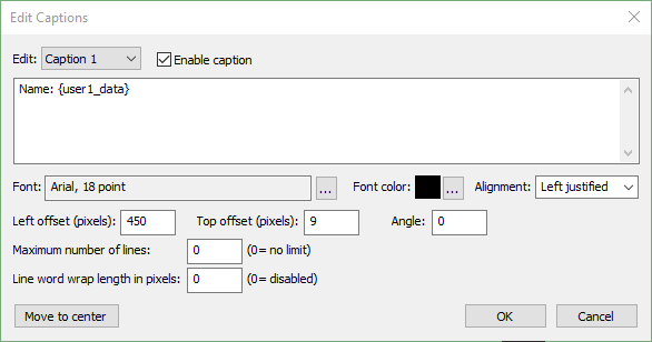
Step 1: Display the print layout editor by clicking on the "Print Layout" button
Step 2: Add a caption by right clicking on the print background and selecting "Add caption"
Step 3: Right click on the caption and select "Edit caption..." to display the "Edit Captions" dialog
Step 4: Add the token {user1_data} to the caption text (this will be replaced by the text entered by the user when the photos are printed):
Keyboard images
Separate keyboard screen images can be defined if you need more control over the appearance of the keyboard. These images should be TIFF images the same size as the resolution of the screen and should be placed in the photo booth images folder. The keyboard images should be named as follows:
keyboard_uppercase.tif - keyboard image showing upper case key legends
keyboard_uppercase_pressed.tif - keyboard image showing upper case key legends with the keys pressed
keyboard_lowercase.tif - keyboard image showing lower case key legends
keyboard_lowercase_pressed.tif - keyboard image showing lower case key legends with the keys pressed
If TIFF keyboard images aren't found the software will attempt to load JPEG images instead (keyboard_uppercase.jpg, keyboard_uppercase_pressed.jpg, keyboard_lowercase.jpg and keyboard_lowercase_pressed.jpg).
When the email option is used (see Uploading to social networks...) the touchscreen keyboard will look for the following keyboard xml definition file and keyboard images:
email_keyboard.xml - XML file defining the keyboard layout
email_keyboard_uppercase.tif - keyboard image showing upper case key legends
email_keyboard_uppercase_pressed.tif - keyboard image showing upper case key legends with the keys pressed
email_keyboard_lowercase.tif - keyboard image showing lower case key legends
email_keyboard_lowercase_pressed.tif - keyboard image showing lower case key legends with the keys pressed
Please note that for compatibility with previous releases the email option will use the standard XML definition file and keyboard images if versions with an email_ prefix aren't found.
When the Twitter upload option is used (see Uploading to social networks...) the touchscreen keyboard will look for the following keyboard xml definition file and keyboard images:
twitter_keyboard.xml - XML file defining the keyboard layout
twitter_keyboard_uppercase.tif - keyboard image showing upper case key legends
twitter_keyboard_uppercase_pressed.tif - keyboard image showing upper case key legends with the keys pressed
twitter_keyboard_lowercase.tif - keyboard image showing lower case key legends
twitter_keyboard_lowercase_pressed.tif - keyboard image showing lower case key legends with the keys pressed
When the send SMS/MMS option is used (see Uploading to social networks...) the touchscreen keyboard will look for the following keyboard xml definition file and keyboard images:
mms_keyboard.xml - XML file defining the keyboard layout
mms_keyboard_uppercase.tif - keyboard image showing upper case key legends
mms_keyboard_uppercase_pressed.tif - keyboard image showing upper case key legends with the keys pressed
mms_keyboard_lowercase.tif - keyboard image showing lower case key legends
mms_keyboard_lowercase_pressed.tif - keyboard image showing lower case key legends with the keys pressed
When the "Message input at end of sequence" option is used the touchscreen keyboard will look for the following keyboard xml definition file and keyboard images:
message_keyboard.xml - XML file defining the keyboard layout
message_keyboard_uppercase.tif - keyboard image showing upper case key legends
message_keyboard_uppercase_pressed.tif - keyboard image showing upper case key legends with the keys pressed
message_keyboard_lowercase.tif - keyboard image showing lower case key legends
message_keyboard_lowercase_pressed.tif - keyboard image showing lower case key legends with the keys pressed
Please take care that the keys are in the same positions in each of the keyboard images and that these also correspond to the values in the keyboard.xml file. The <background_color>, <text_color>, <prompt>, <legend> and <shifted_legend> tags in the keyboard.xml file are ignored when keyboard images are used to define the appearance of the keyboard.
Note: If you only need to change the keyboard layout and are happy with the default keyboard display you only need to create a keyboard.xml file in the photo booth images folder and can delete the keyboard screen images (keyboard_uppercase.tif, keyboard_uppercase_pressed.tif, keyboard_lowercase.tif and keyboard_lowercase_pressed.tif). If keyboard images are defined the <prompt> tags in the keyboard.xml file will be ignored.