The touchscreen editor provides an interactive way to add touchscreen actions to control the photo booth. It also provides a way to edit touchscreen keyboards and survey screens.
Click on "Touchscreen actions..." in the "General" tab of the "Photo Booth Settings" dialog to open the touchscreen editor:
Touchscreen actions control what happens when different parts of a screen are touched. Different actions can be defined for specific areas of each screen.
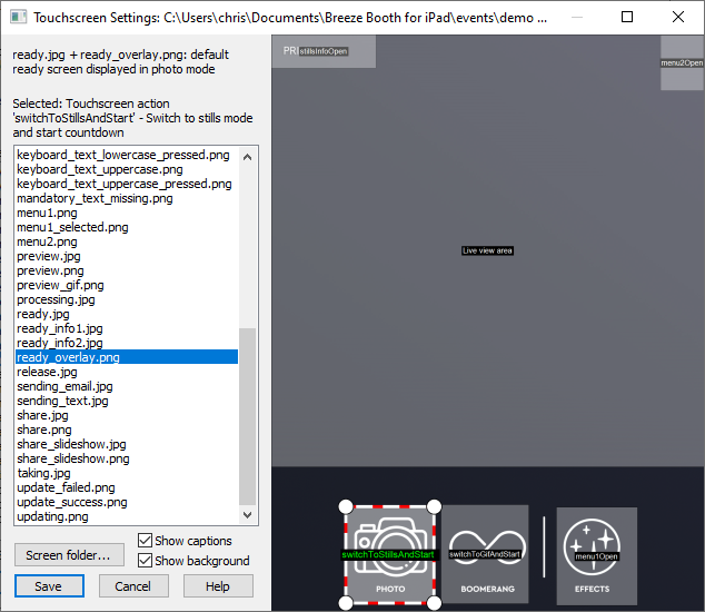
There is a list of screen and keyboard images on the left of the window and on the right there is a preview showing the screen and any touchscreen actions that have been defined for that screen. Click on any screen image in the list to select that screen. A brief description of the selected screen is displayed on the left above the list of screens. Please see Screens Displayed to the User for more information about the different screens.
The folder containing the screen images can be opened in a Windows File Explorer window by pressing the "Screen folder..." button.
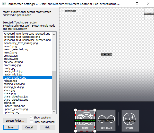
If the selected screen is a PNG overlay the associated JPEG background image will be displayed with the overlay. The background image can be hidden by unchecking "Show background" and transparent areas in the overlay will be shown using a checkerboard pattern:
Touchscreen actions are shown in the preview as gray boxes with a caption in the center indicating their action. Click on touchscreen action to select it. The box defining the active area of the touchscreen action will be highlighted to indicate that it has been selected (as shown below) and a brief description of the action will be displayed on the left above the list of screen images. If the screen display becomes too crowded due to the captions they can be turned off by unchecking "Show captions".
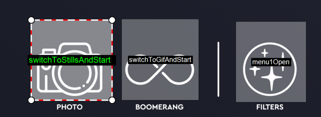
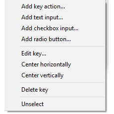
The touchscreen area can be moved by left clicking the mouse and dragging it to the new position. The size of the touchscreen area can be adjusted by clicking on one of the corner handles and dragging it. Right click on the touchscreen action to display an option menu:
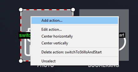
Select "Add action..." to add a new touchscreen action (you can also right click anywhere on the screen preview to display a menu to add a new action). This will display a list of the touchscreen actions that can be added to the screen:
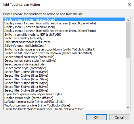
Select an action from the list and click "OK" to add it or "Cancel" to dismiss the dialog.
Select "Edit action..." from the right click menu to edit an existing action:
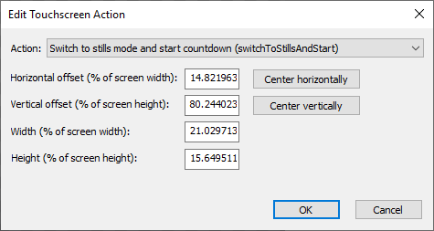
The action can be changed to a different action by selecting the new action from the dropdown list. The position and size of the the active area is defined as percentages of the screen width and height. This ensures that the touchscreen actions appear in the same relative position on the screens of iPads with different screen resolutions.
Live View Area
The live view area defines the size and position of the live view display on the screen and is only shown when one of the ready screens is selected in the touchscreen editor. There can only be one live view area in the ready screen. It can be moved and resized in the same way as touchscreen actions but it cannot be deleted.
The touchscreen editor can also be used to edit keys, text inputs, checkboxes and radio buttons for keyboards and survey screens. Keyboards and survey screens work in a similar way. Their visual appearance is defined by two or four PNG images e.g.
keyboard_text_lowercase.png - keyboard appearance when no keys are pressed and shift is not pressed
keyboard_text_lowercase_pressed.png - defines the appearance of a key when it is pressed and shift is not pressed
keyboard_text_uppercase.png - keyboard appearance of a key when it is not pressed but shift is pressed
keyboard_text_uppercase_pressed.png - defines the appearance of a key when it is pressed and shift is pressed
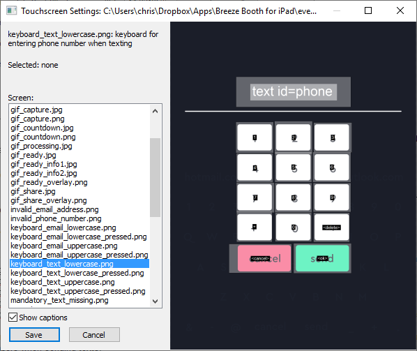
Their behavior is defined by the key, text area, checkbox and radio button actions defined using the touchscreen editor. Select the keyboard_text_lowercase.png screen image from the list to display the keyboard used for entering phone numbers when sending texts:
The keyboards for sharing by email or text can be created automatically by selecting the sharing options when running the event creator.
Simple survey screens can be added by right clicking on any screen in the touchscreen editor's preview area and selecting "Add survey screen..." Please see the section on Keyboards and Surveys for details.
Adding/Editing Keyboard Actions
Right click on a key to edit it (or right click on the screen image and select "Add key action..." to add one):
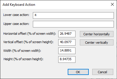
Each key can have a lower case action (which is applied when it is tapped and shift is not pressed) and an upper case action (which is applied when it is tapped and shift is pressed). The action can be a single character (e.g. the number 4 for entering a phone number), a string of characters (.e.g. "gmail.com" to provide shortcuts for entering common email addresses) or one of the following special actions enclosed in angle brackets:
<ok> - validate the input and close the keyboard if all the input fields are valid else display an error screen if available
<cancel> - cancel keyboard input and close the keyboard screen without validating the inputs
<delete> - delete the last character from the currently selected text input area
<clear> - clear the currently selected text input area
<shift> - toggle keyboard shift: all the keys on the keyboard will be updated by copying areas from the lower case image if shift is not selected or the upper case image if shift is selected
<space> - add a space to the currently selected text input area
Right click on a text input to edit it (or right click on the screen image and select "Add text input..." to add one):
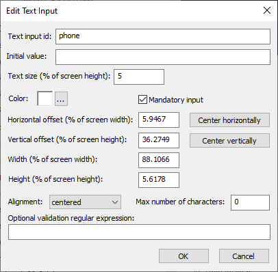
The text input id is used to identify the text input when it is saved in the XML summary file. The following special ids perform extra validation when closing the keyboard:
phone - checks that the phone number starts with an optional + (for international numbers) followed by a series of digits
email - checks whether the text is an email address in the form name@domain.com
cc - checks whether the text is an email address in the form name@domain.com
Text keyboards can only contain a single text input with id "phone". Any additional text inputs with id "phone" are ignored.
Email keyboards can have 1 or more text inputs with id "email" and zero or more text inputs with id "cc". The "email" fields are used as the "to" addresses when sending emails and the "cc" fields are set to the CC email addresses.
The initial value can be used to initialize the text field with pre-defined text. This field can use tokens e.g. if the user entered their email address in survey screen 1 the token {survey1_text_email} could be used to initialize the text field with their email address so that they don't have to enter it again.
The size of the text displayed in the text input is defined as a percentage of the screen height to ensure screens appear the same on different iPads with different screen sizes and resolutions.
The color setting specifies the color of the text in the text input.
The background appearance of the text input area is copied from the lower case keyboard image if the text area is not selected or the upper case keyboard image if it is selected. The area defined in the touchscreen editor specifies the area that is copied from the lower case or upper case keyboard image.
Please see Keyboards and Surveys for more information.
If the "Mandatory input" checkbox is selected the text input must contain one or more characters and must be a valid phone number (if the id is set to "phone") or a valid email address (if the id is set to "email" or "cc").
An error screen can be displayed if a mandatory text field is empty when tapping <ok> to close the keyboard by creating a PNG screen image with the name mandatory_text_missing followed by the text input id e.g. if there is a mandatory text input to enter your first name with the id "firstName" the error screen should be named mandatory_text_missing_firstName.png.
The alignment setting controls whether the text displayed in the text input is left, center or right justified.
Set the "Max number of characters" to the maximum number of characters that can be entered or set this to 0 if there isn't a limit. When the user has entered the maximum number of characters any new characters will be ignored.
An optional regular expression can be used to validate the text entered by the user. For example if you want people to always prefix phone numbers with + followed by the country code the regular expression could be set to \+\d+
Leave this entry blank if you do not need to validate the input.
An error screen can be displayed if the text fails to match the regular expression when tapping <ok> to close the keyboard by creating a PNG screen image with the name regex_failed followed by the text input id e.g. if the input field has the id "phone" the error screen should be named regex_failed_phone.png.
Right click on a checkbox to edit it (or right click on the screen image and select "Add checkbox input..." to add one):
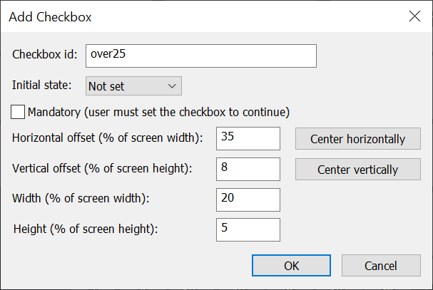
The checkbox id is used to identify the checkbox input when it is saved in the XML summary file.
The appearance of the checkbox is copied from the lower case keyboard image if the checkbox is not selected or the upper case keyboard image if it is selected. The area defined in the touchscreen editor specifies the area that is copied from the lower case or upper case keyboard image.
Please see Keyboards and Surveys for more information.
The "Initial state" dropdown list specifies whether the checkbox should be set when the keyboard or survey screen is displayed. The dropdown list has three options: "Set" which checks the checkbox, "Not set" which unchecks the checkbox and "Expression" which allows an expression containing tokens to set the initial state of the checkbox. If the expression evaluates to 0 or an empty string the checkbox will be unchecked otherwise it will be checked.
Example of using an expression to set the initial state of the checkbox: Suppose the photo booth has a survey at the start of the sequence which has a checkbox asking whether the user would like to receive special offers and you want to show display a similar checkbox in the email keyboard in case the user has changed their mind. If the checkbox has an id of "special" and in survey screen 1 the token {survey1_checkbox_special} can be used for the initial value expression to copy the user's response to the checkbox in the email keyboard.
If the "Mandatory" checkbox is selected the checkbox must be selected before the keyboard is closed using the "<ok>" action. If the user taps the "<ok>" touchscreen action without selecting a mandatory checkbox an optional error screen will be displayed. The error screen is a PNG overlay image named mandatory_checkbox_<id>.png where <id> is the id of the checkbox.
Right click on a radio button to edit it (or right click on the screen image and select "Add radio button..." to add one):
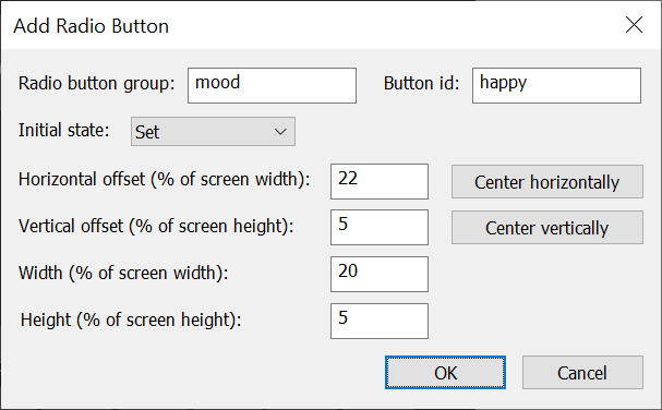
Radio buttons are similar to checkboxes but allow multiple choice type questions where one and only one button can be selected. The "Radio button group" setting is used to define groups of radio buttons. One and only one button can ever be selected within a given group of radio buttons.
The button id is used to identify the selected button when it is saved in the XML summary file.
The appearance of the each radio button is copied from the lower case keyboard image if the button is not selected or the upper case keyboard image if it is selected. The area defined in the touchscreen editor specifies the area that is copied from the lower case or upper case keyboard image.
Please see Keyboards and Surveys for more information.
The "Initial state" dropdown list specifies whether the radio button should be set when the keyboard or survey screen is displayed. The dropdown list has three options: "Set" which sets the radio button, "Not set" which unsets the radio button and "Expression" which allows an expression containing tokens to set the initial state of the radio button. If the expression evaluates to 0 or an empty string the radio button will not be set otherwise it will be set.
Please note that one and only one radio button in a group can be set. If multiple radio buttons in a group have their initial value set only the first one will be set. If none of the radio buttons is set initially the user must select one of them before they are able to continue.
An optional error screen will be displayed if the user taps the "<ok>" touchscreen action without selecting one of the buttons in the radio button group. The error screen is a PNG overlay image named mandatory_radiobtn_<id>.png where <id> is the id of the radio button group.
Menus
Menus are displayed in a similar way to keyboards and survey screens but only need two screens to define them e.g. menu1.png and menu1_selected.png. Menus can only contain touchscreen actions. Actions that represent a state (e.g. colorStyle) are displayed using the main image (e.g. menu1.png) with the touchscreen area being copied from the "selected" image (e.g. menu1_selected.png).
Please see Menus for more information.