Touchscreen keyboards are used to capture user input such as email addresses and phone numbers for sharing photos or for responses to survey questions. A touchscreen keyboard can contain one or more keys, text entry areas, checkboxes or radio buttons.
The appearance of the touchscreen is defined by PNG screen images e.g.
The appearance of the keyboard is defined by up to four PNG screen images e.g.
keyboard_email_lowercase.png - lower case keys
keyboard_email_lowercase_pressed.png - lower case keys that have been pressed
keyboard_email_uppercase.png - upper case keys
keyboard_email_uppercase_pressed.png - upper case keys that have been pressed
The background for the keyboard is defined by an optional PNG image e.g. keyboard_email_background.png. If the PNG background image is not found the keyboard background will use the default_background.jpg background image instead.
The keyboard_email_uppercase.png and keyboard_email_uppercase_pressed.png can be omitted if you don't need shifted characters e.g. for a keyboard used to enter phone numbers.
The behavior is defined by actions added using the Touchscreen Editor in the Event Editor and is saved in an XML file e.g.
keyboard_email.xml
The alpha channel of the PNG images can be used to control their transparency allowing areas of the keyboard to fully or semi-transparent so that the screens beneath them are visible.
When the keyboard is displayed initially it uses the lower case image e.g. keyboard_email_lowercase.png.
If the touchscreen action for a normal key is pressed (e.g. 'a') the area corresponding to the touchscreen action is copied from the "lower case pressed" image to provide a visual indication that it has been pressed and then it reverts to the "lower case" image. The letter (or word) in the touchscreen action is added to the text area that has focus.
If a touchscreen action set to <shift> is pressed the keyboard is updated to use touchscreen areas copied from the "upper case" image and the next normal key pressed will perform the upper case action. A visual indication that the key has been pressed is provided by copying the touchscreen action area from the "upper case pressed" image. The keyboard then reverts to the lower case state.
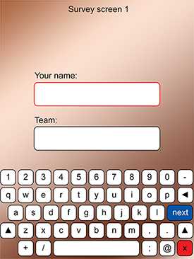
If keyboard has one or more text fields the currently selected one (aka the text field having input focus) is highlighted by copying the area assigned to the text field from the "lower case pressed" image. All other text fields will display the area copied from the "lower case" image. This provides a way of giving the user a visual indication of which text field will receive input.
Checkboxes can be selected or not selected. When the user taps on the touchscreen area for a checkbox it toggles its state i.e. switches from selected to not selected or vice versa. The checkbox's state is indicated by copying the touchscreen area from the "lower case" image when it is not selected or from the "lower case pressed" image if it is selected.
Radio buttons are similar to checkboxes except that they can be defined in groups and one and only one radio button can be selected within a group. If you tap on a radio The radio button's state is indicated by copying the touchscreen area from the "lower case" image when it is not selected or from the "lower case pressed" image if it is selected.
The different types of keyboard have different prefixes:
keyboard_email_ for the touchscreen keyboard displayed when sharing by email e.g. keyboard_email_lowercase.png
keyboard_text_ for the touchscreen keyboard displayed when sharing by text e.g. keyboard_text_lowercase.png
survey<n>_keyboard_ for the touchscreen keyboard for survey screen <n> e.g. survey1_keyboard_lowercase.png
keyboard_sync - keyboard displayed in response to the "enter code then sync" touchscreen actions
An MP3 audio file can be played when the keyboard is displayed by naming it the same as the keyboard e.g. to play an audio file when the email keyboard is displayed name the MP3 file keyboard_email.mp3.
For survey screens the MP3 audio file can be named survey<n>.mp3 or survey<n>_keyboard.mp3.
Tip: Create the keyboard images with a transparent background and use the keyboard background image to provide the background. This will make it easier to re-use keyboard layouts in other events because you can change the background simply by replacing the background image.
Survey Keyboard Example Images
survey1_keyboard_lowercase.png |
survey1_keyboard_lowercase_pressed.png |
survey1_keyboard_uppercase.png |
survey1_keyboard_uppercase_pressed.png |
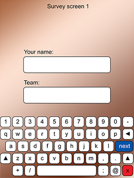
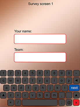

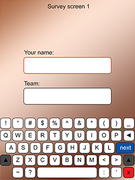
When the survey keyboard is first displayed it will show the lower case image with the area for the first text field highlighted by copying the area from the survey1_keyboard_lowercase_pressed.png image:
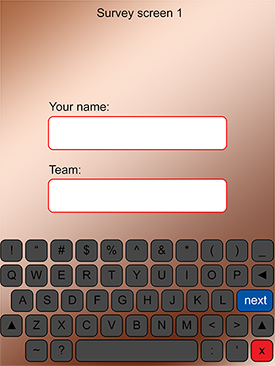
When tapping the normal keys the key will be briefly highlighted using an area copies from the survey1_keyboard_lowercase_pressed.png image and the text added to the highlighted text field. Tap on the shift (up arrow) key and all the keys will copied from the survey1_keyboard_uppercase.png image except the two shift keys which are copied from the survey1_keyboard_uppercase_pressed.png image because they are pressed:
Keyboard Images for checkboxes and radio buttons
Checkboxes and radio buttons only require the lowercase and lowercase_pressed keyboard images. They display an area copied from the lowercase keyboard image when not selected and from the lowercase_pressed image when selected.
Here are some example keyboard images for a survey2 screen with checkboxes and radio buttons:
survey2_keyboard_lowercase.png
|
survey2_keyboard_lowercase_pressed.png |
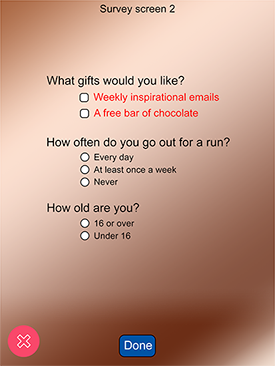
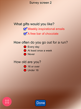
The keyboard was setup so that the "free bar of chocolate" checkbox was initially set and the two radio button groups defaulted to the first radio button in each group. What is initially displayed is the survey2_keyboard_lowercase.png image with areas copied from the survey2_keyboard_lowercase_pressed.png for the "chocolate" checkbox and the "every day" and "16 or over" radio buttons:

Displaying error screens
Text Fields
Text fields can be mandatory or optional and can be used to enter free text, email addresses or telephone numbers. They can also have an optional regular expression to validate the input. If the user taps the area with the "<ok>" touchscreen action and a text field contains an error an optional error screen will be displayed, the text area will be highlighted by giving it input focus and the keyboard screen won't close.
The type of text field is defined by the "id" entered using the touchscreen action editor in the Event Editor.
If the id is set to "email" or "cc" the text field will only accept an email address e.g. name@site.com.
If the user enters an invalid email address or enters nothing in a mandatory email or cc text field the optional error screen named invalid_email_address.png is displayed for a few seconds.
If the id is set to "phone" the text field will only accept a phone number in the form of 0 followed by a series of numbers or + followed by a series of numbers (for international dialing codes).
If the user enters an invalid phone number or enters nothing in a mandatory phone text field the optional error screen named invalid_phone_number.png is displayed for a few seconds.
If the id is set to anything else the text field will accept any text. If the user fails to enter anything in a mandatory text field an optional error screen can be displayed for a few seconds. The default name for the error screen is mandatory_text_missing.png but a specific error screen can be displayed by adding the id to the end of the filename e.g. if the text field id is "age" the error screen would be named mandatory_text_missing_age.png.
If the text field is defined with a regular expression to valid the input the error screen that is displayed should be named regex_failed_<id>.png where <id> is the id of the text field e.g. if the input field has the id "phone" the error screen should be named regex_failed_phone.png.
Checkboxes
Checkboxes can mandatory which means that they have to be set when the "<ok>" touchsreen action is tapped. If the user taps the "<ok>" touchscreen action without selecting a mandatory checkbox an optional error screen will be displayed. The error screen is a PNG overlay image named mandatory_checkbox_<id>.png where <id> is the id of the checkbox.
Radio Buttons
If a group of radio buttons is defined with none of the buttons being set the keyboard will be displayed with none of the radio buttons selected. An optional error screen will be displayed if the user taps the "<ok>" touchscreen action without selecting one of the buttons in the radio button group. The error screen is a PNG overlay image named mandatory_radiobtn_<id>.png where <id> is the id of the radio button group.
Surveys
Survey keyboards are displayed after the starting the shooting sequence before the initial countdown commences. The first survey screen should have the prefix survey1_keyboard_ e.g. survey1_keyboard_lowercase.png. You can define as many survey screens as you like by naming them in sequence e.g. survey1_keyboard_, survey2_keyboard_, survey3_keyboard_ etc.
If the user taps a touchscreen area with the action "<cancel>" the shooting sequence is aborted and the ready screen is displayed.
The survey data is included in the XML summary file that is saved after each session e.g.
<?xml version="1.0" encoding="ISO-8859-1"?>
<breeze_systems_photobooth id="86EC1E02-CCBA-49F5-ABA7-5292B475255D" app="Breeze Booth" build="26" name="iPad Pro 11" version="1.0">
<photo_information>
<date>2019/02/14</date>
<time>17:35:57</time>
<photobooth_images_folder>Portrait with survey and sharing/portrait</photobooth_images_folder>
<prints>1</prints>
<survey_data>
<survey1_text id="name">Chris</survey1_text>
<survey1_text id="team">Breeze</survey1_text>
<survey2_chkbox id="emails">0</survey2_chkbox>
<survey2_chkbox id="chocolate">1</survey2_chkbox>
<survey2_radio id="run">2</survey2_radio>
<survey2_radio id="age">1</survey2_radio>
</survey_data>
<photos>
<photo md5="ab18e7101d89e13dc00de241e2533651" image="1">17-35-57.jpg</photo>
<processed/>
<output md5="e55acfce5c8314afe46061ad1f895a8a">prints/17-35-57.jpg</output>
</photos>
</photo_information>
</breeze_systems_photobooth>
The survey data can also be added to print captions or included in message text using tokens. These have the form {<survey#>_<type>_<id>}
e.g.
The token for the results from a text field with id “name” on survey screen 1 would be: {survey1_text_name}
A checkbox with id “chocolate” on survey screen 2 would be: {survey2_chkbox_chocolate} – returns 1 if checked else 0
A radio button in group “run” on survey screen 2 would be: {survey2_radio_run} – returns the id of selected radio button
A simple survey screen can be added to an event by right clicking on any screen in the touchscreen editor and selecting "Add survey screen..." to display the add survey dialog:
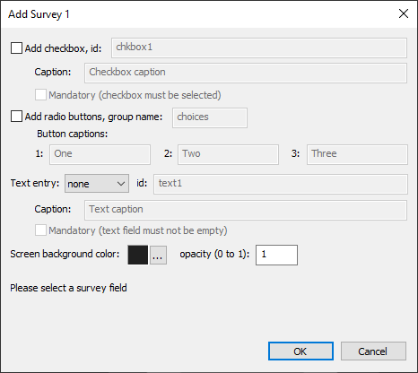
Select "Add checkbox" to add a checkbox to the survey screen and enter its id and caption. Select "Mandatory (checkbox must be selected)" to make the checkbox mandatory.
A set of up to three radio buttons can be added by selecting "Add radio buttons". Enter the group name used to identify and group the radio buttons together and add captions for two or three buttons.
A text entry field and keyboard can be added by setting the "Text entry:" dropdown list to normal, autoemail or email, enter the id used to identify it and a caption to be displayed above the text entry field. Select "Mandatory (text field must not be empty)" to make the text entry field mandatory.
The normal keyboard option creates a keyboard suitable for free text input complete with upper and lower case characters, spaces and punctuation.
The autoemail and email keyboard options create a keyboard with lower case characters and the punctuation characters allowed in email addresses. The autoemail option is the same as the email option except that the photos, GIF or video is automatically emailed after capture.
Click on the "..." button to the right of the screen background color preview to change the background color f the survey screen. The "opacity" setting can be used to set the opacity of the survey screen background from fully transparent (opacity=0) to fully opaque (opacity=1).
Click on "OK" to create the survey screen images and the XML file defining the inputs and actions. The appearance of the survey screens can be changed by editing them in an image editor such as Photoshop. The settings for the checkbox and radio buttons and the keyboard actions can be edited using the touchscreen editor.
Extracting Survey Data
The survey data is stored in the XML summary file that is saved after each set of photos. It can be extracted using the Survey Data tool in Breeze Hub.
Survey data can also be accessed using tokens to allow it to be used in email messages or to define the background/overlay suffix for prints, burst GIFs or videos.
Example: Using a survey screen to chose a background for AI background removal
Create a survey1 keyboard which has a radio button group named background and radio buttons with ids bg1, bg2, bg3 etc. for each of the backgrounds the user can choose. The token to read the user input is the keyboard name, "survey1", followed by the input type, "radio", and the group id, "background", giving {survey1_radio_background}.
If we set the print background/overlay suffix to {survey1_radio_background} it will set the suffix to bg1, bg2, bg3 etc. depending on the background chosen by the user in the survey. This can be used to select the correct screens for the countdown and the correct background and overlay for the print:
1_bg1.jpg - countdown screen background
1_bg1.png - countdown screen overlay
background_bg1.jpg - print background
overlay_bg1.png - print overlay
For some applications such as unattended rental photo booths it is useful to be able to enter a code to select a particular event. To do this define a sync keyboard (keyboard_sync.xml) and use the syncCodeFromReady, menu1SyncCode or menu2SyncCode touchscreen actions. The sync code touchscreen actions will display the keyboard_sync keyboard to allow the user to enter a code and then update the current event. The code entered by the user can be accessed using the {syncCode} token and this can be used in the event server URL (e.g. https://bb4ipad.com/sync/code/{syncCode}) to select a different download URL or in the Dropbox prefix if syncing via Dropbox to select a different download path.
The easiest way to see how this works is to run the demo example. This can be loaded by setting the event server URL to https://bb4ipad.com/sync/code:
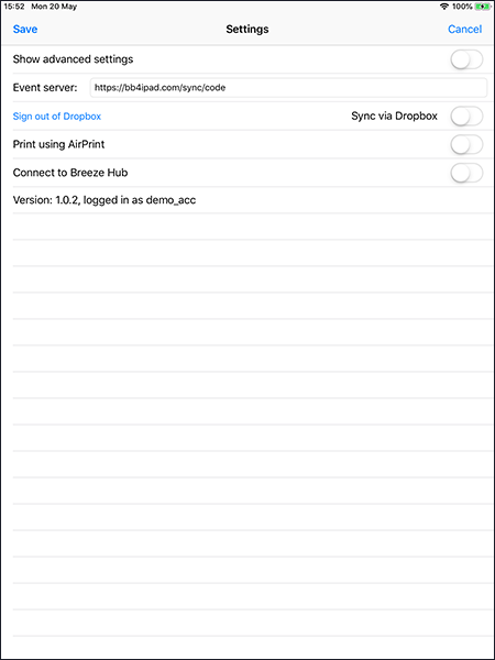
The go to the events screen and tap "Update all events" in the bottom right hand corner. This will download an event which has a sync keyboard for the user to enter an event code. It also downloads a device_settings.xml file which sets everything up for using event codes by changing a few settings on the iPad:
<?xml version="1.0" encoding="ISO-8859-1"?>
<breeze_booth build="1" version="1.0.2">
<device_settings>
<syncServer>https://bb4ipad.com/sync/code/{syncCode}</syncServer>
<syncServerPost>false</syncServerPost>
<syncViaDropbox>false</syncViaDropbox>
<syncCode>000000</syncCode>
</device_settings>
</breeze_booth>
The device_settings.xml file sets the sync server URL to https://bb4ipad.com/sync/code/{syncCode}. This will download events from a subfolder of https://bb4ipad.com/sync/code using the sync code entered by the user.
The device_settings.xml file also disables sync via HTTPS POST or Dropbox and sets the initial sync code to 000000 which is the event code used for entering sync codes in the example.
The example defines three folders of events:
https://bb4ipad.com/sync/code/000000 - this event displays a start screen with no live view and a single button to enter an event code
https://bb4ipad.com/sync/code/123456 - this event is a simple single photo setup with the print showing the event name as 123456
https://bb4ipad.com/sync/code/654321 - this event is a simple single photo setup with the print showing the event name as 654321
Run the event and enter 123456 for the event code and it will load event #123456. Tap the gear icon in the top right hand corner to enter a new event code and either enter 000000 to go back to the initial event or 654321 to load event 654321. An error message is displayed if an invalid event code is entered.
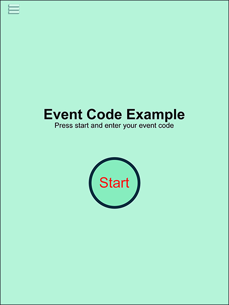
The example files can be downloaded from https://bb4ipad.com/sync/code/sync_code_example.zip